
I still remember how hard it was to learn {ggplot2} after only knowing a
little about R1. Sure, the plots seemed pretty. But compared to the ways I had used R before,
{ggplot2}’s syntax seemed almost counter-intuitive. Its pipe-like + workflow–building
layer-by-layer– was like nothing I had ever used before. Not to mention, I was unfamiliar with central terms of art like
“geoms” and “aesthetics”.
But then again…the plots were really pretty.
Fortunately for me, being able to generate pretty plots was a powerful motivator. Because not long after
committing myself to learning how to {ggplot2}, I realized why everyone likes it so much–it’s actually
really easy! Once I learned about the key building blocks of ggplot(), aes(), and
geom_.*()), I could create pretty plots for all sorts of data types and relationships.
It’s in the details
Over time my #dataviz has gotten a lot better, but it’s had very little to
do the actual plotting of data points ({ggplot2} outputs beautiful plots by default). Instead, my
dataviz has improved because I learned how to (a) more effectively label scales, data points, and other dimensions
of a plot and (b) (re)size and save high-resolution plots using nice-looking fonts.
With this in mind, my goal with this post is to demonstrate how data visualizations can be improved via proper labelling. And since this idea was inspired by my last post, I will extend the example about the relationship between miles per gallon and number of cylinders. If you read the setup section from the last post, you can skip ahead (it’s the same).
Setup
To follow along with the examples in this post, you will need to load the {tidyverse} set of packages and define a couple stylistic functions used throughout to make the plots even prettier.
## load tidyverse
library(tidyverse)
#> ── Attaching packages ───────────────────────────────────────────────────── tidyverse 1.2.1 ──
#> ✔ ggplot2 3.0.0.9000     ✔ purrr   0.2.5
#> ✔ tibble  1.4.2          ✔ dplyr   0.7.6
#> ✔ tidyr   0.8.1          ✔ stringr 1.3.1
#> ✔ readr   1.1.1          ✔ forcats 0.3.0
#> ── Conflicts ──────────────────────────────────────────────────────── tidyverse_conflicts() ──
#> ✖ dplyr::filter() masks stats::filter()
#> ✖ dplyr::lag()    masks stats::lag()

## create style theme
my_theme <- function() {
  theme_minimal(base_family = "Roboto Condensed") +
    theme(plot.title = element_text(size = rel(1.5), face = "bold"),
      plot.subtitle = element_text(size = rel(1.1)),
      plot.caption = element_text(color = "#777777", vjust = 0),
      axis.title = element_text(size = rel(.9), hjust = 0.95, face = "italic"),
      panel.grid.major = element_line(size = rel(.1), color = "#000000"),
      panel.grid.minor = element_line(size = rel(.05), color = "#000000"),
      legend.position = "none")
}
my_labs <- function() {
  labs(title = "Average miles per gallon by number of cylinders",
    subtitle = "Scatter plot depicting average miles per gallon aggregated by number of cylinders",
    x = "Number of cylinders", y = "Miles per gallon",
    caption = "Source: Estimates calculated from the 'mtcars' data set")
}
my_save <- function(file) {
  ggsave(file, width = 7, height = 4.5, units = "in")
}
The data set featured in this post is mtcars, which is bundled as part of the core datasets package.
Specifically, examples will feature the mpg (miles per gallon) and cyl (number of
cylinders) variables.
## print first six rows
head(mtcars)
#>                    mpg cyl disp  hp drat    wt  qsec vs am gear carb
#> Mazda RX4         21.0   6  160 110 3.90 2.620 16.46  0  1    4    4
#> Mazda RX4 Wag     21.0   6  160 110 3.90 2.875 17.02  0  1    4    4
#> Datsun 710        22.8   4  108  93 3.85 2.320 18.61  1  1    4    1
#> Hornet 4 Drive    21.4   6  258 110 3.08 3.215 19.44  1  0    3    1
#> Hornet Sportabout 18.7   8  360 175 3.15 3.440 17.02  0  0    3    2
#> Valiant           18.1   6  225 105 2.76 3.460 20.22  1  0    3    1
Labelling dataviz
I think most would agree a good data visualization clearly conveys a pattern (or lack of pattern) while being easy to understand, while a great data visualization conveys a pattern (or lack of pattern) while being easy to understand and aesthetically pleasing. The difference between good and great can be something as minor as color palette, but, in my experience, more often than not the only difference between a good visualization and great visualizations is labelling.
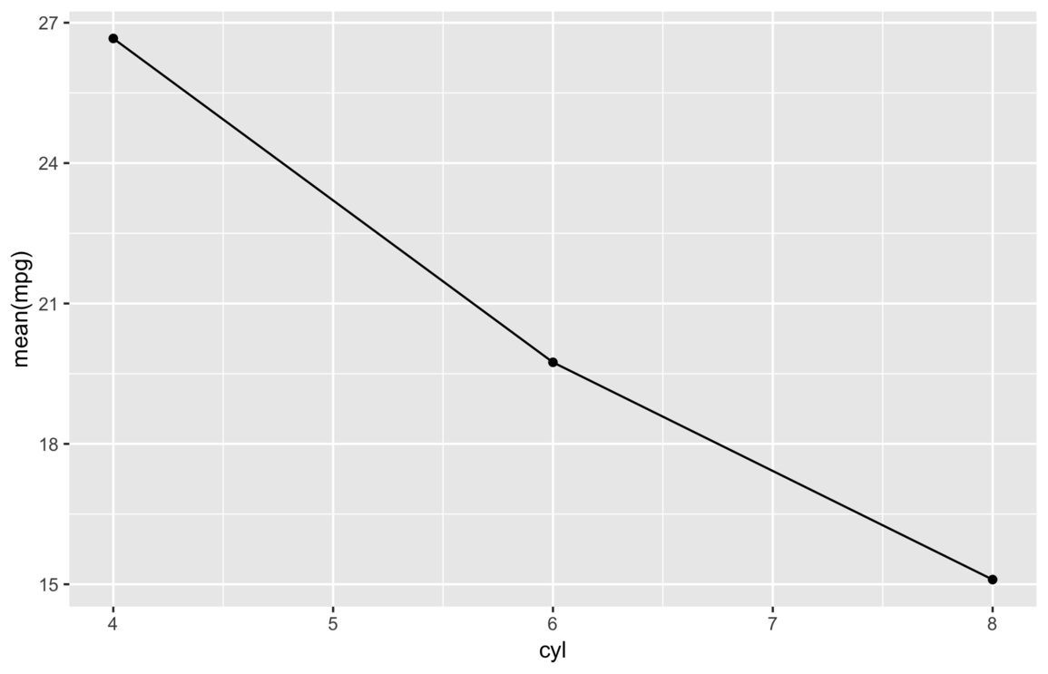
In my last post, for example, the first successful plot of mpg by cyl was only
okay–it’s a little bland and it uses an actual expression for an axis title.
But then I replaced the expression and added a custom theme and a few more labels, and I think it started to border on being good.
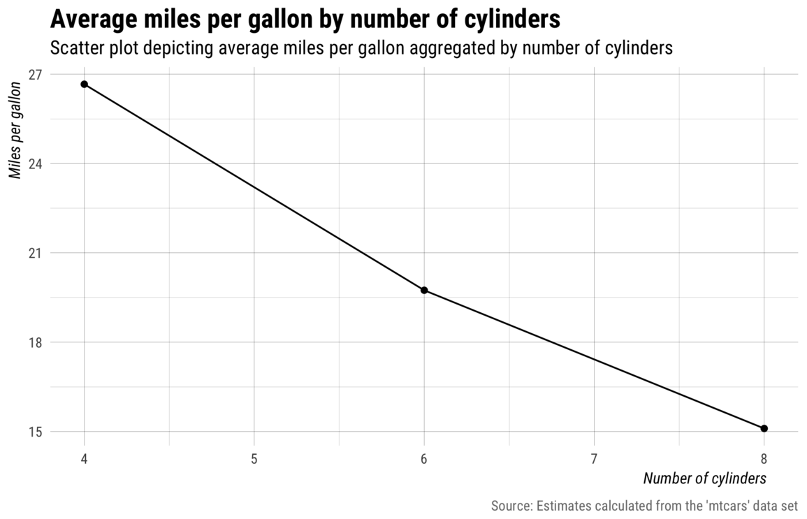
The combination of style changes and labels clearly made a big difference but, still, I don’t think the above plot is mind-blowing or overly impressive.
Since there aren’t that many data points, I think this visualization can be further improved–with the help
of {ggrepel}–by labelling the individual data
points–either as an additional layer or as a standalone plot (I didn’t think the summarized cyl
estimates added much so I dropped the mean line/points).
## - add row names as make variable
## - add noise to cyl for spacing (store as cyl2)
## - plot and format labels with ggrepel
## - adjust x-axis labels
## - specify custom fill colors
mtcars %>%
  mutate(make = row.names(mtcars),
    cyl2 = case_when(
      cyl == 4 ~ cyl - runif(1, .25, .5),
      cyl == 6 ~ cyl - runif(1, .00, .1),
      cyl == 8 ~ cyl + runif(1, .75, 1.25),
      TRUE ~ cyl
    )) %>%
  ggplot(aes(x = cyl2, y = mpg)) +
  ggrepel::geom_label_repel(aes(fill = factor(cyl), label = make),
    family = "Roboto Condensed Light", label.padding = 0.2, label.size = .25,
    min.segment.length = 100, color = "black", size = 3.4) +
  my_theme() +
  my_labs() +
  scale_x_continuous(breaks = c(4, 6, 8)) +
  scale_fill_manual(values = c("#efd0ef", "#d0efd0", "#d0daef")) +
  my_save("img/tick-marks-final.png")
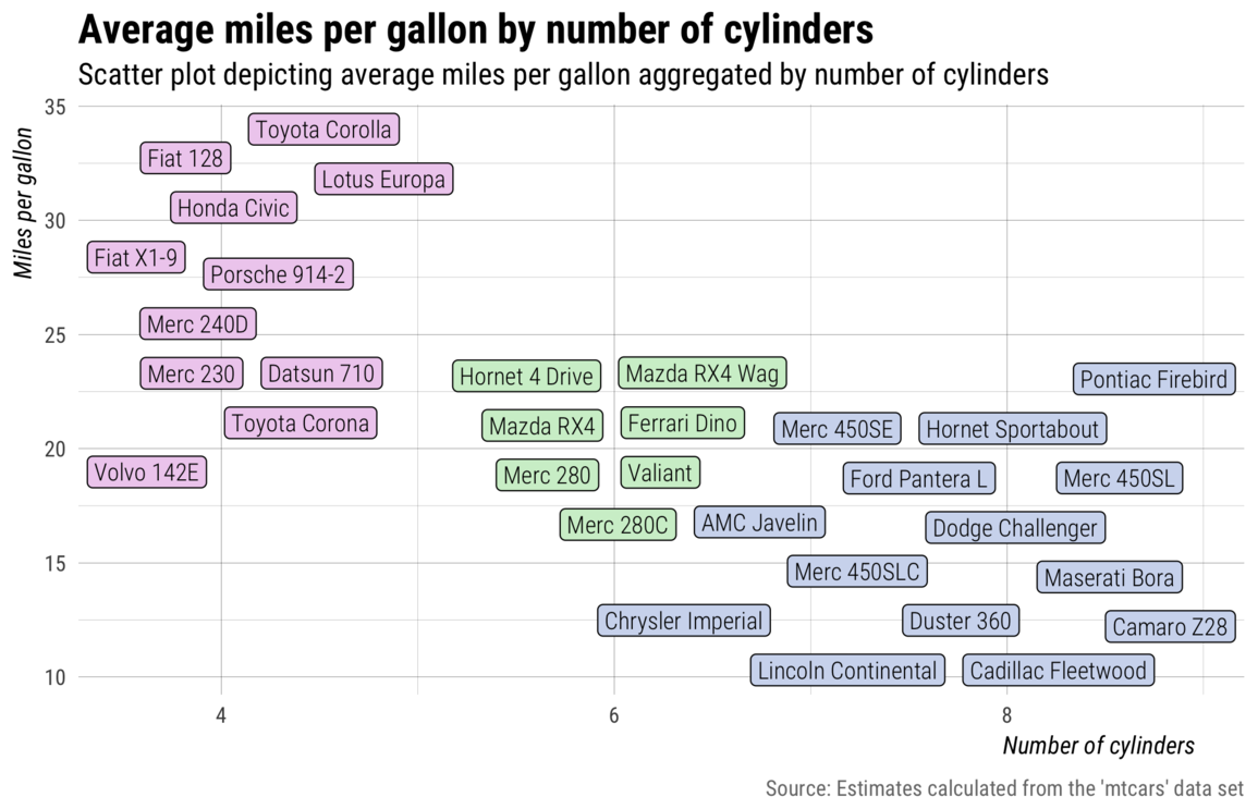
As you can see in the code chunk above, I also added some additional noise to the cyl variable to help
out {ggrepel}’s spacing algorithm. The approach made it possible to plot and label each car in
the data set without overloading or distracting the image with too much information. So, now, not only does the
image convey the pattern between mpg and cyl, but it does so in a way that more people can
recognize ( 4-cylinders is less meaningful than Honda Civic, for example), while arguably being
even more visually pleasing.
Notes
1 I knew just enough to read in data, do some structural equation
modeling, and generate some simple plots via base::plot() and base::histogram().