
A popular workflow in R uses {dplyr} to group_by() and then
summarise()1 variables. It’s an intuitive and easy way to aggregate and describe data,
especially along multiple dimensions. The cost of being both powerful and user-friendly, however, is its arguably
inconvenient default method for assigning names to summarized values. As the code illustrates below, users can provide
their own names when using summarize().
## explicitly named summarize variable
mtcars %>%
  group_by(cyl) %>%
  summarize(mpg = mean(mpg))
#> # A tibble: 3 x 2
#>     cyl   mpg
#>   <dbl> <dbl>
#> 1     4  26.7
#> 2     6  19.7
#> 3     8  15.1
But when users don’t explicitly name the summarized values, instead of inheriting the name of a summarized variable (in
this case mpg), variables are named–by default–with the text of the expression used to create the
summarized value.
For example, the code below summarizes by estimating the mean mpg for cars grouped by number of
cyl. The code is fairly straight forward, and you can probably see why users often assume the returned
summarized data would contain two variables cyl and mpg.
## unnamed summarize variable
mtcars %>%
  group_by(cyl) %>%
  summarize(mean(mpg))
#> # A tibble: 3 x 2
#>     cyl `mean(mpg)`
#>   <dbl>       <dbl>
#> 1     4        26.7
#> 2     6        19.7
#> 3     8        15.1
But as you can see, the variable names wind up being cyl and mean(mpg)– instead of simply
cyl and mpg. This default behavior may seem obnoxious at first, but it makes a lot of sense
when you think about using two or more variables when calculating summarize() values.
Regardless, while it’s definitely a good idea to provide your own summary variable names, you will invariably find yourself in a situation where you would like to plot summarized variables that were named using the text of the expressions used to create them.
Thus, my goal with this post is to identify three common mistakes users make when attempting to map
variables from dplyr::summarize() to aesthetic
dimensions of a plot with {ggplot2} and conclude by describing a solution.
Setup
To follow along with the examples in this post, you will need to load the {tidyverse} set of packages and define a couple stylistic functions used throughout to make the plots even prettier.
## load tidyverse
library(tidyverse)
#> ── Attaching packages ───────────────────────────────────────────────────── tidyverse 1.2.1 ──
#> ✔ ggplot2 3.0.0.9000 ✔ purrr 0.2.5
#> ✔ tibble 1.4.2 ✔ dplyr 0.7.6
#> ✔ tidyr 0.8.1 ✔ stringr 1.3.1
#> ✔ readr 1.1.1 ✔ forcats 0.3.0
#> ── Conflicts ──────────────────────────────────────────────────────── tidyverse_conflicts() ──
#> ✖ dplyr::filter() masks stats::filter()
#> ✖ dplyr::lag() masks stats::lag()
## create style theme
my_theme <- function() {
theme_minimal(base_family = "Roboto Condensed") +
theme(plot.title = element_text(size = rel(1.5), face = "bold"),
plot.subtitle = element_text(size = rel(1.1)),
plot.caption = element_text(color = "#777777", vjust = 0),
axis.title = element_text(size = rel(.9), hjust = 0.95, face = "italic"),
panel.grid.major = element_line(size = rel(.1), color = "#000000"),
panel.grid.minor = element_line(size = rel(.05), color = "#000000"),
legend.position = "none")
}
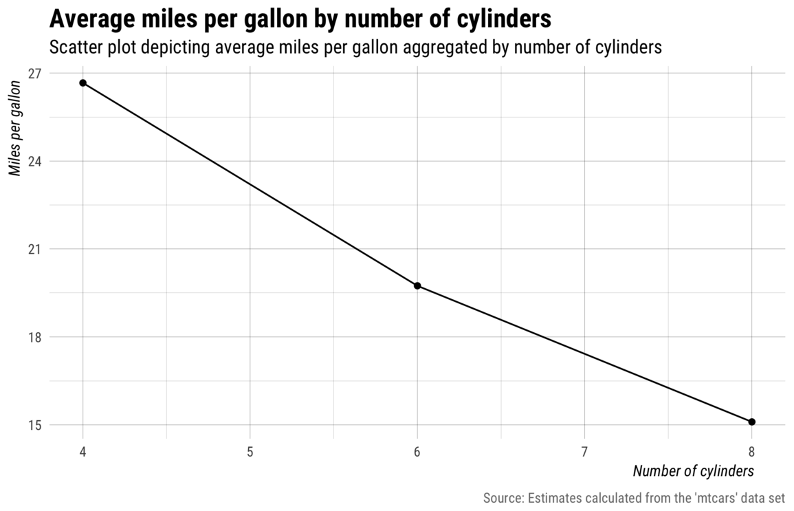
my_labs <- function() {
labs(title = "Average miles per gallon by number of cylinders",
subtitle = "Scatter plot depicting average miles per gallon aggregated by number of cylinders",
x = "Number of cylinders", y = "Miles per gallon",
caption = "Source: Estimates calculated from the 'mtcars' data set")
}
my_save <- function(file) {
ggsave(file, width = 7, height = 4.5, units = "in")
}The data set featured in this post is mtcars, which is bundled as part of the core datasets package.
Specifically, examples will feature the mpg (miles per gallon) and cyl (number of
cylinders) variables.
## print first six rows
head(mtcars)
#>                    mpg cyl disp  hp drat    wt  qsec vs am gear carb
#> Mazda RX4         21.0   6  160 110 3.90 2.620 16.46  0  1    4    4
#> Mazda RX4 Wag     21.0   6  160 110 3.90 2.875 17.02  0  1    4    4
#> Datsun 710        22.8   4  108  93 3.85 2.320 18.61  1  1    4    1
#> Hornet 4 Drive    21.4   6  258 110 3.08 3.215 19.44  1  0    3    1
#> Hornet Sportabout 18.7   8  360 175 3.15 3.440 17.02  0  0    3    2
#> Valiant           18.1   6  225 105 2.76 3.460 20.22  1  0    3    1
Mapping incorrect names
When visualizing data with ggplot2, one of the first and most important
steps entails mapping observed variables in the data set to the aesthetic dimensions of a plot. But aesthetic
mapping will only work as expected when you provide the correct names via ggplot2::aes().
The following section describes three common mistakes users make that result in the mapping of incorrect names.
1. Assuming a statistic inherits the name of a variable.
A common mistake is to assume that summarizing via mean() or median() results in a
variable with the same name. For example, if we summarize the mean of mpg like we did above, i.e.,
summarize(mean(mpg)), and then try to map y = mpg, we get an error because “mpg”
doesn’t exist.
## this gets an error because there is no variable named "mpg"
mtcars %>%
  group_by(cyl) %>%
  summarize(mean(mpg)) %>%
  ggplot(aes(x = cyl, y = mpg)) +
  geom_point() +
  geom_line()
#> Error: Aesthetics must be either length 1 or the same as the data (3): x, y
We know from the summarize section above the variable’s name is actually mean(mpg).
As this example illustrates, it is incorrect to assume that summarized estimates inherit the name of the
variable they summarize. This may seem annoying at first, but it makes sense when you think about times when you
may want to summarize using two or more variables in the data set.
2. Repeating the expression used in summarize().
A second common mistake is to assume that you can simply repeat the expression used in summarize()
when specifying aesthetic mappings.
## this also doesn't work because it tries to caculate the mean of mpg
mtcars %>%
  group_by(cyl) %>%
  summarize(mean(mpg)) %>%
  ggplot(aes(x = cyl, y = mean(mpg))) +
  geom_point() +
  geom_line() +
  my_save("img/empty-plot.png")
#> Warning in mean.default(mpg): argument is not numeric or logical: returning
#> NA

#> Warning in mean.default(mpg): argument is not numeric or logical: returning
#> NA

#> Warning in mean.default(mpg): argument is not numeric or logical: returning
#> NA
#> Warning: Removed 3 rows containing missing values (geom_point).
#> Warning: Removed 3 rows containing missing values (geom_path).
#> Warning in mean.default(mpg): argument is not numeric or logical: returning
#> NA

#> Warning in mean.default(mpg): argument is not numeric or logical: returning
#> NA

#> Warning in mean.default(mpg): argument is not numeric or logical: returning
#> NA
#> Warning: Removed 3 rows containing missing values (geom_point).
#> Warning: Removed 3 rows containing missing values (geom_path).
![]()
The result is a handful of warnings and an empty plot. The above code fails because it tries to calculate mean of
mpg, which, again, doesn’t exist in the summarized data.
3. Passing the expression as a quoted string.
The third common mistake is to treat the summarized expression name as a string.
## if we put quotes around it, it assumes it's a string
mtcars %>%
  group_by(cyl) %>%
  summarize(mean(mpg)) %>%
  ggplot(aes(x = cyl, y = "mean(mpg)")) +
  geom_point() +
  geom_line() +
  my_save("img/static-y.png")
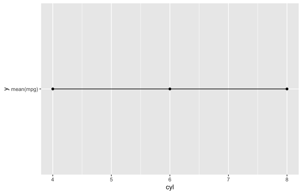
This time we get a plot and no warnings, but it’s clearly not right. It shows every y value is
exactly the same, but it seems far fetched to think the average miles per gallon would not vary with number of
cylinders.
In this case, the literal string "mean(mpg)" is mapped to the y variable
value, which means it’s converted to a factor and the single factor level is coded as 1 at each
observation.
Solution: use tick marks
At this point it should be clear the name of the summarized mpg variable is actually “mean(mpg),” only
now we also know wrapping the expression with quotes doesn’t work because it assumes the expression is a literal
string, not a variable name.
The solution to correctly mapping unnamed summarize() variables is to use tick marks–the apostrophe-like
symbol at the top-left of your keyboard. Tick marks work a lot like quotes insofar as they open and close and wrap
all elements into a single object. The difference is tick marks assume the marked object references a symbol. To
illustrate, the code below assigns 10 random numbers to x and then prints it using both ticks and
quotes.
## assign 10 random numbers to x
x <- rnorm(10)

## print x wrapped in quotes
"x"
#> [1] "x"

## print x wrapped in tick marks
`x`
#>  [1] -0.4614799  0.9832479 -1.7872899  0.2977996  0.1209820  1.3454420
#>  [7] -0.6433342  0.4772910  1.8410117  0.0823669
So, really, tick marks are used to distinguish symbols that contain one or more unfriendly punctuation/characters, e.g., parenthesis, dashes, spaces, etc.
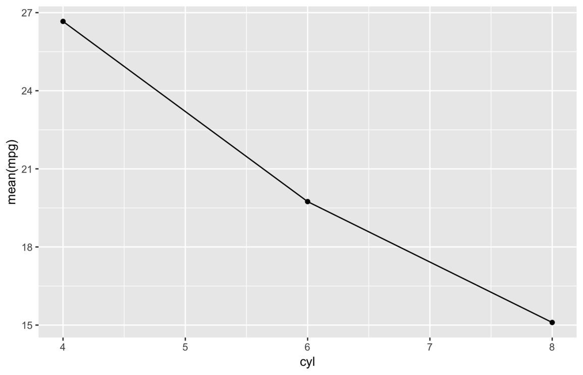
With this knowledge, we can now fix the featured summarize() example by wrapping the summarized
expression, which functions as the name of the summarized variable, in tick marks.
## if we put quotes around it, aes() assumes we are entering a string
mtcars %>%
  group_by(cyl) %>%
  summarize(mean(mpg)) %>%
  ggplot(aes(x = cyl, y = `mean(mpg)`)) +
  geom_point() +
  geom_line() +
  my_save("img/tick-marks.png")
Of course, most audiences don’t really want to see expression text on a plot, so we can improve this plot by adding
some better labels and a custom theme via the previously defined my_theme() and my_labs()
functions.
## use tick marks instead of quotes to indicate variable name
mtcars %>%
  group_by(cyl) %>%
  summarize(mean(mpg)) %>%
  ggplot(aes(x = cyl, y = `mean(mpg)`)) +
  geom_point() +
  geom_line() +
  my_theme() +
  my_labs() +
  my_save("img/with-labs.png")
Notes
1 The s and z toward the end of summarise() and
summarize() are interchangeable.